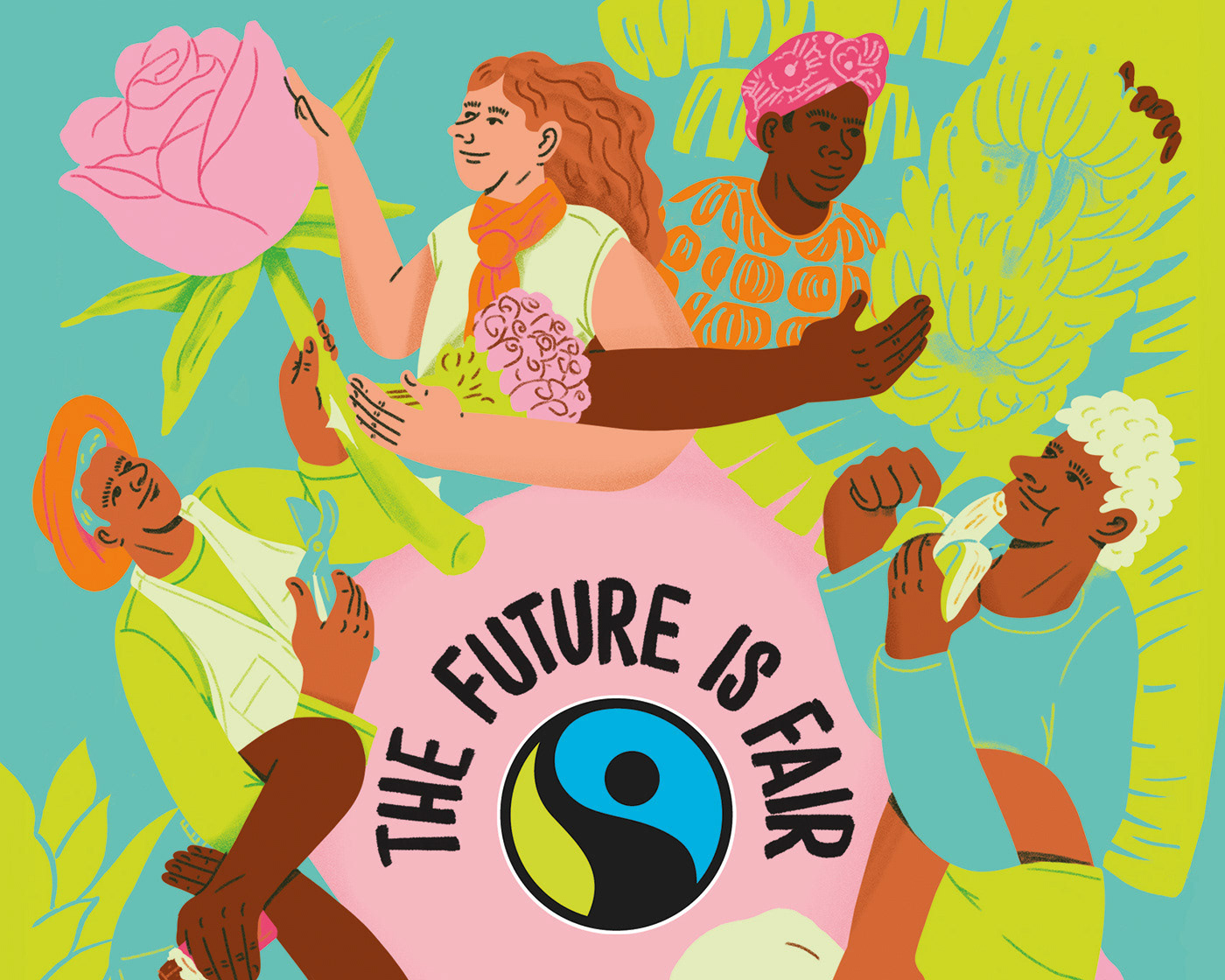
I was asked to create a key visual and illustrations as well as a logo for Good Clothes Fair Pay – a campaign to call on brands and retailers to put in place, implement, monitor, and publicly disclose a time-bound and target-bound plan to close the gap between actual and living wages.
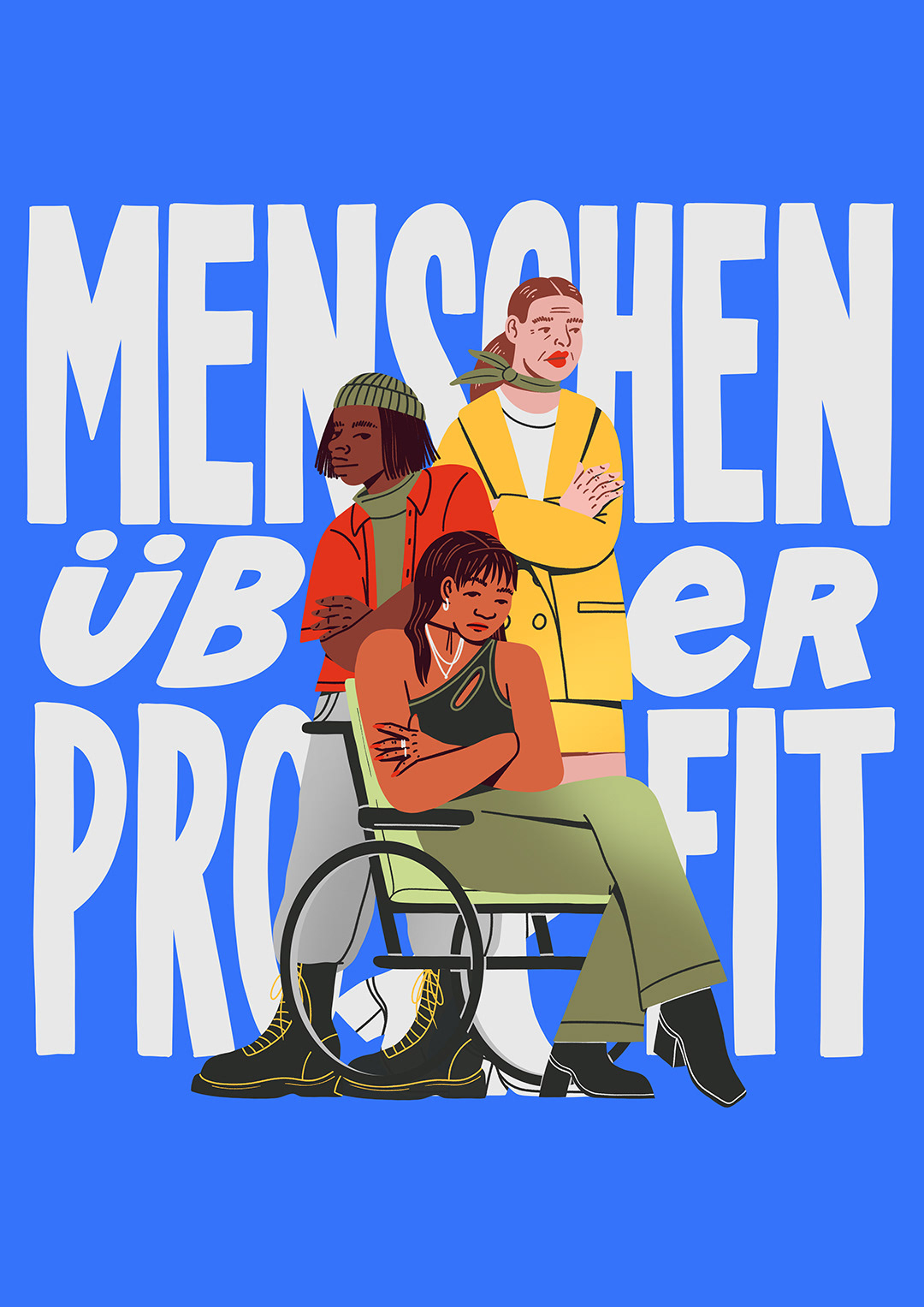
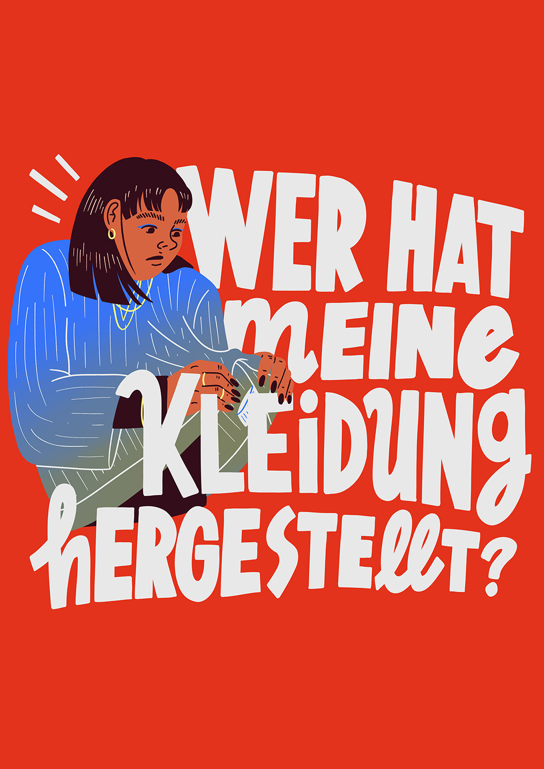
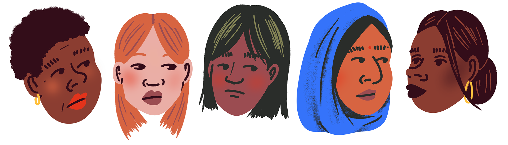
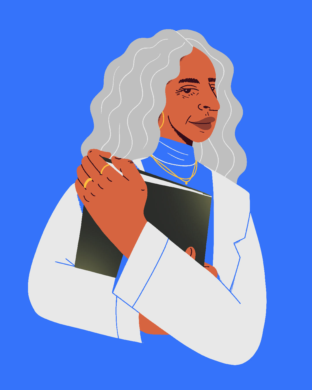
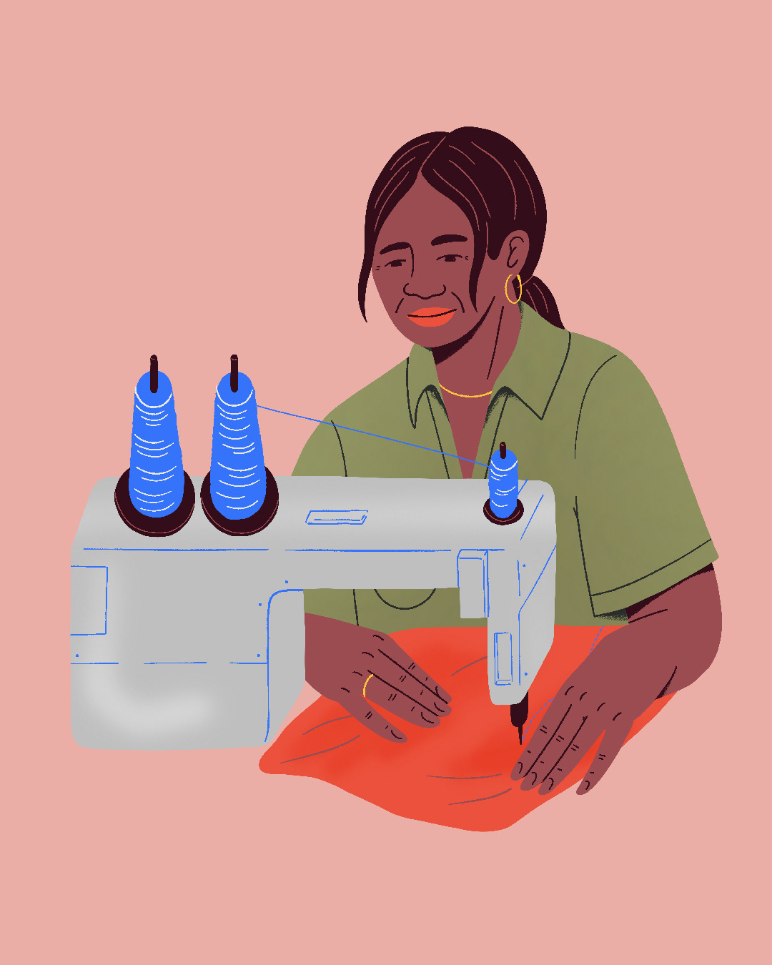
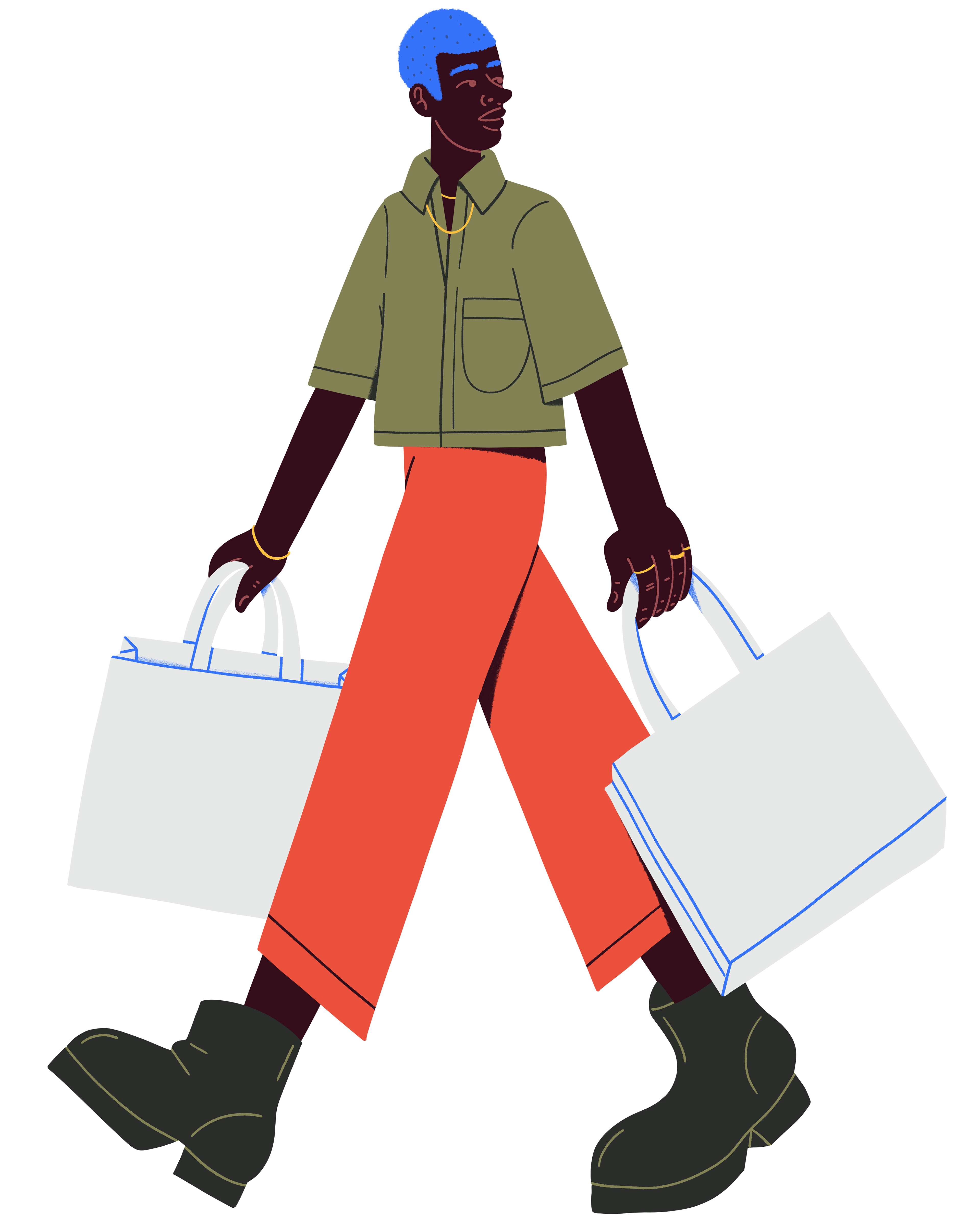
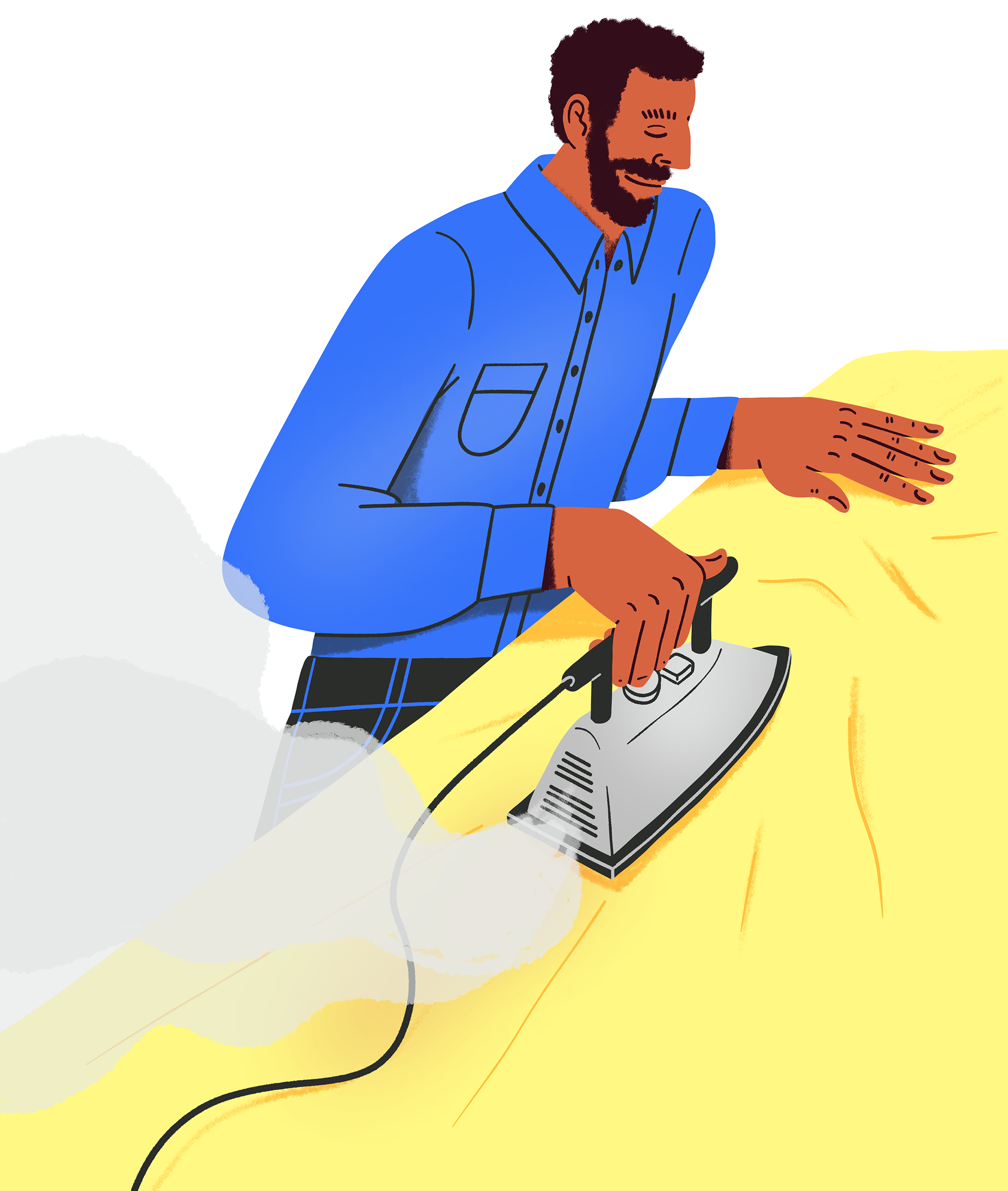
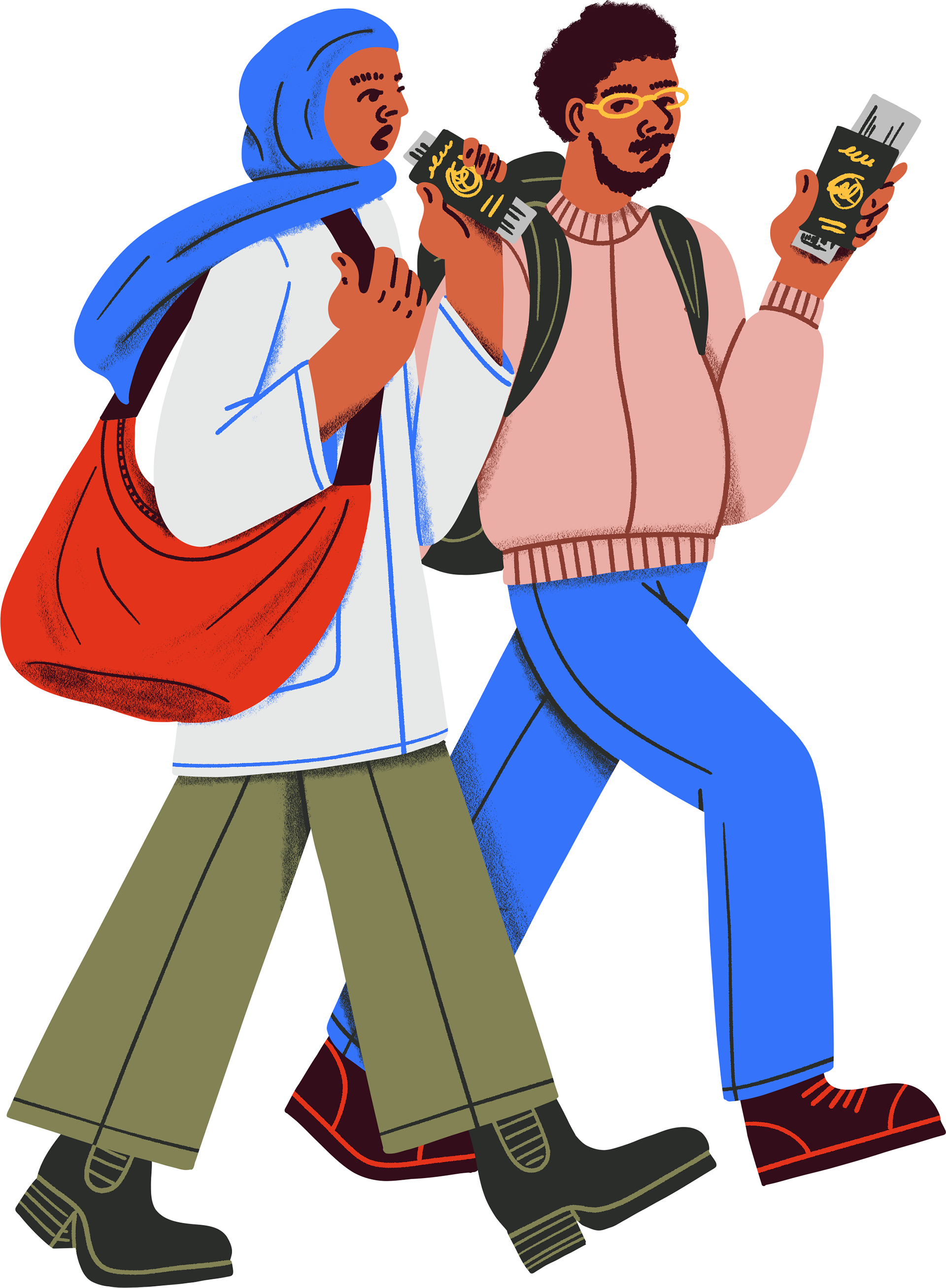
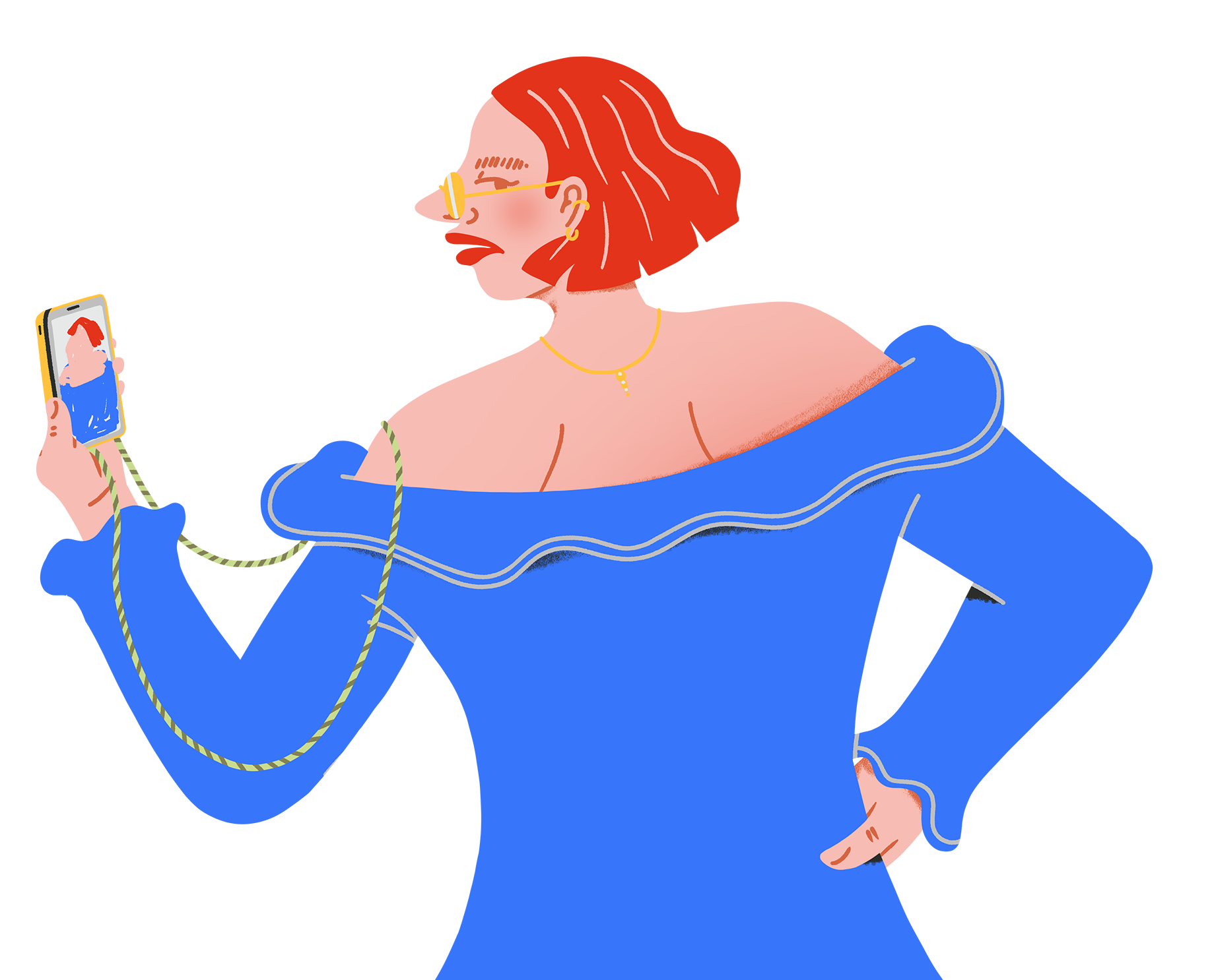
I created several illustrations of textile workers, consumers and activists as well as typographic posters. Completed with small illustrations that should accompany the social media campaign created by Good Clothes Fair Pay.
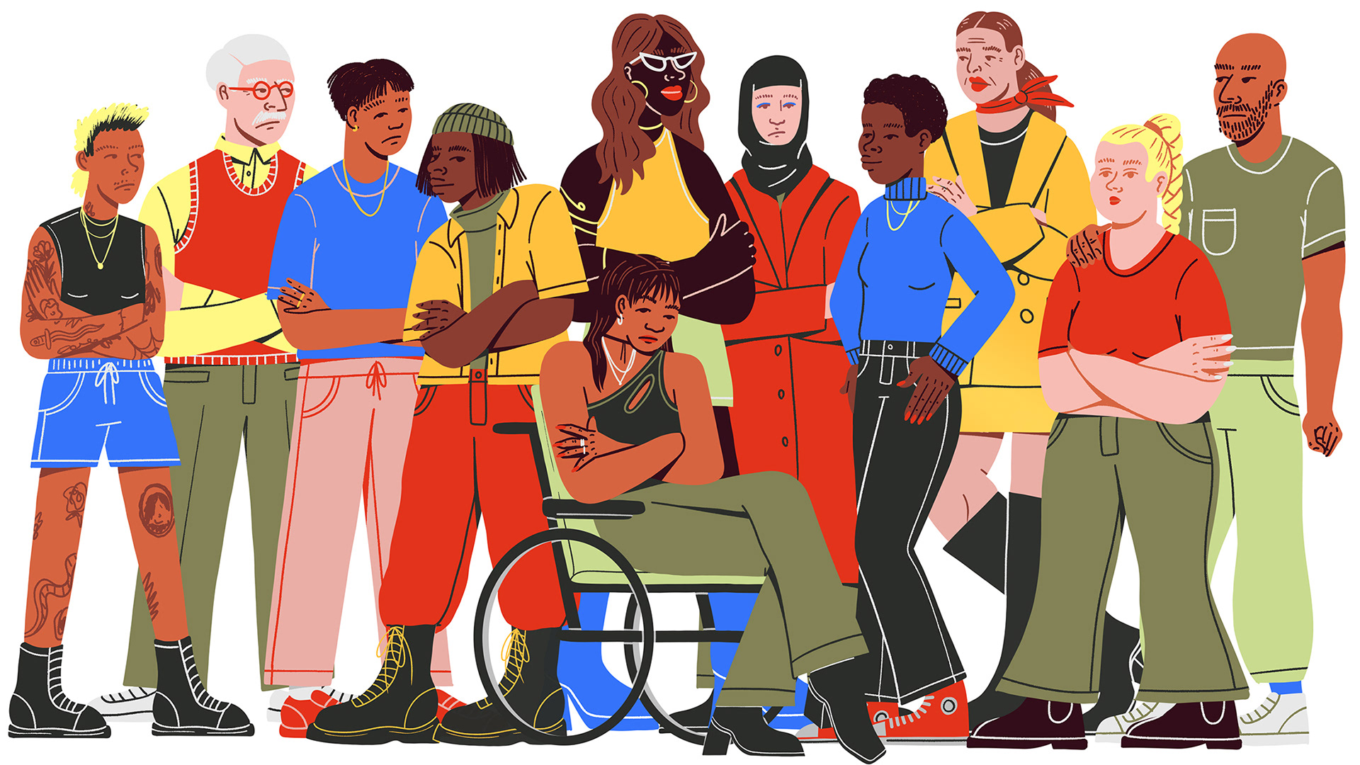
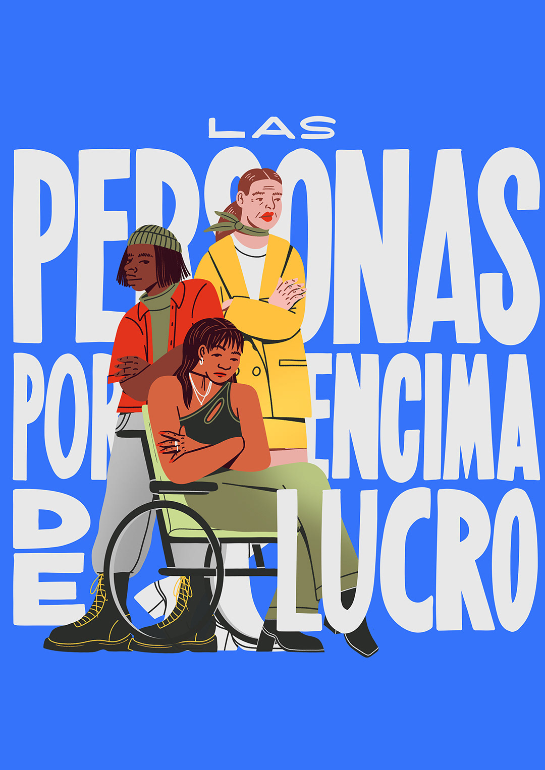
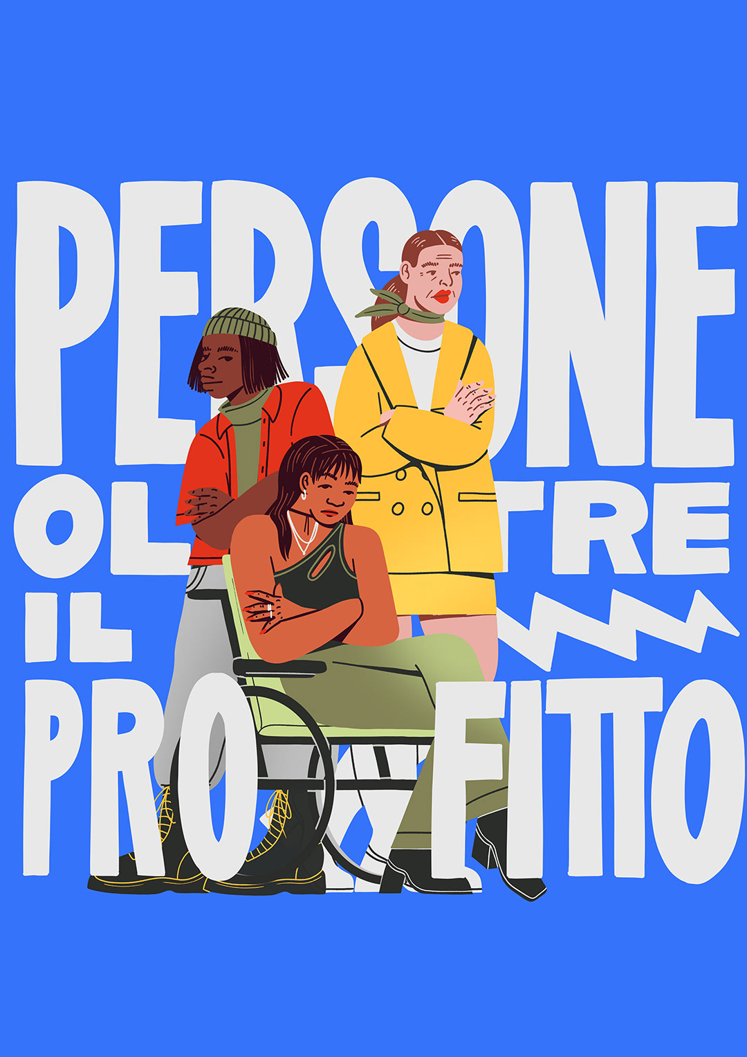
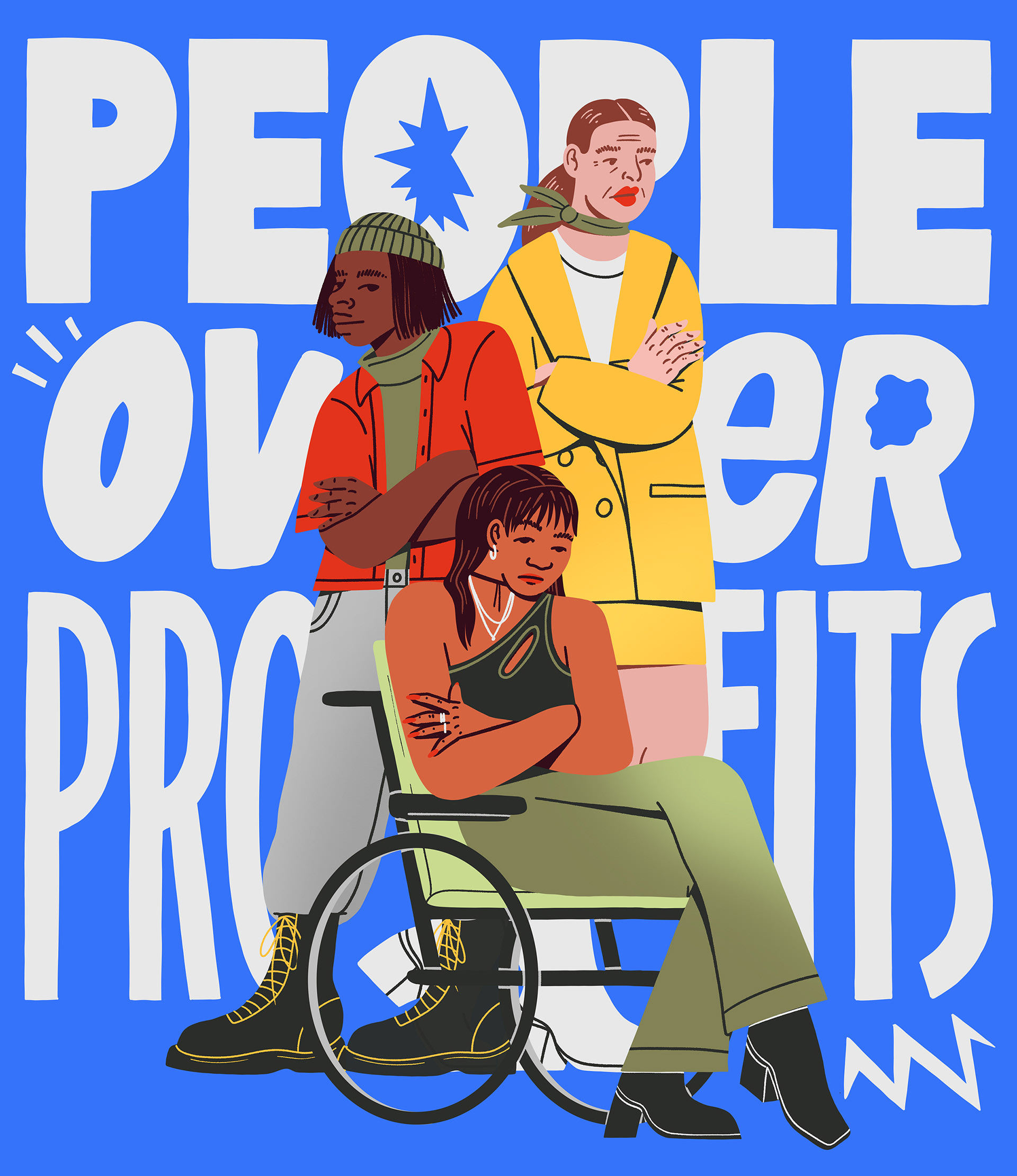
Emily Sear, Creative Director: "The inspiration for the creative direction came from alternative comics and pop art. Because the campaign is EU-wide, we needed a visual language that crossed borders, transcended language barriers and made people feel inspired and energised - ready to take action. We also wanted to be able to represent everyone involved in the campaign, from worker to voters to law makers. Illustration allowed us to do this in an engaging way that felt very different to traditional campaign marketing. The pop art influence can be seen in the primary colour palette and the comics influence in the hand drawn type."
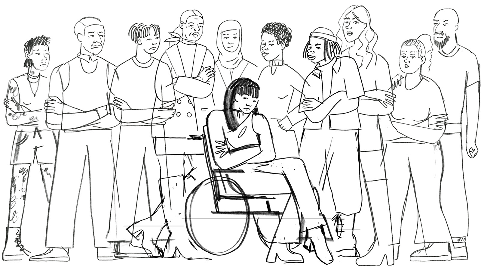
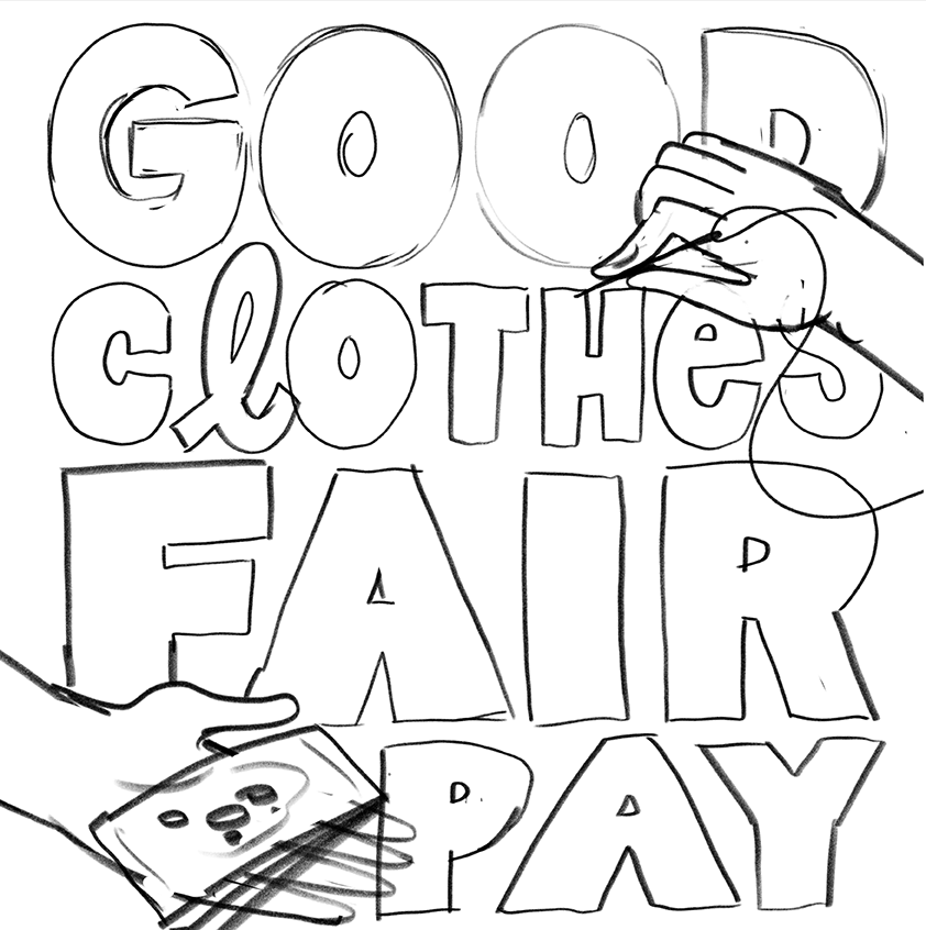
After having received the brief, I created sketches for the illustrations of various workers, activists and consumers. They would be used flexibly with the social media graphics created by GCFP.
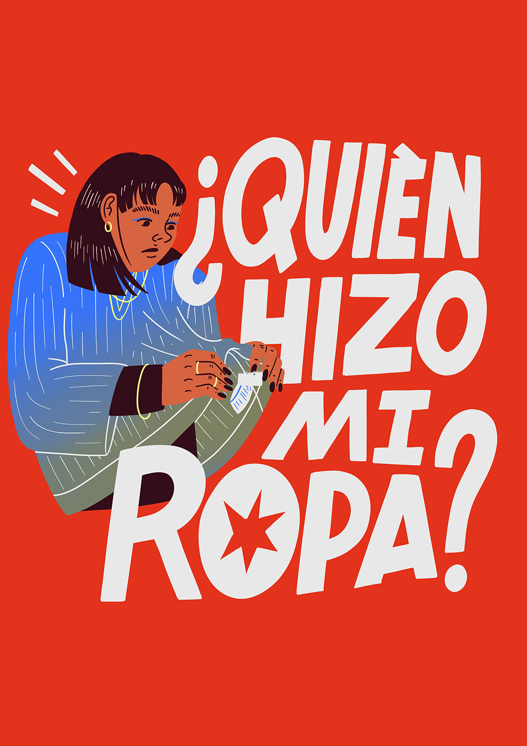
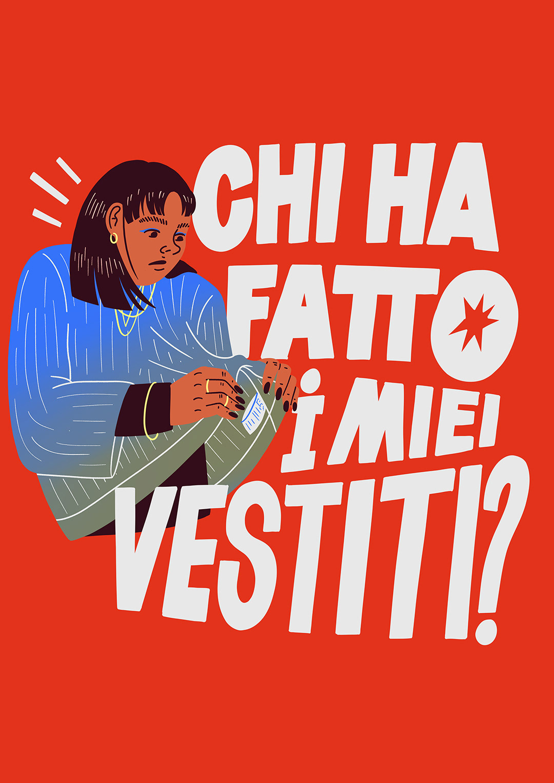
The posters should convey the messages clearly, so I focused on a simple but bold hand made lettering in combination with illustrations to support the message. It was important to show various humans from all ages, races and body types, it should be accessible and easy to understand. The only limitation was the colour palette.
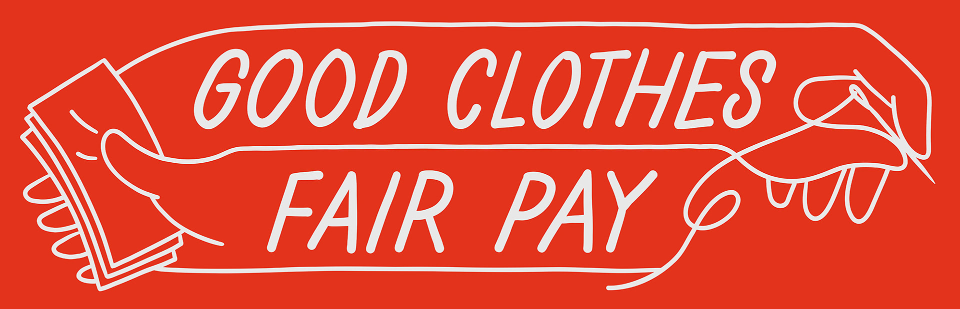
Logo for the website

Initial sketches for the logo, ideas by Emily Sear
The posters should work as DIN formats as well as on socials, hence the quare format
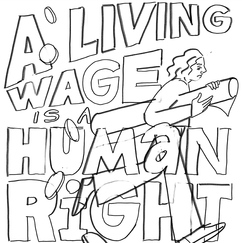
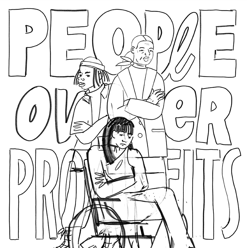
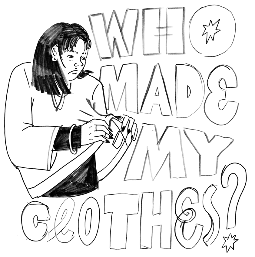
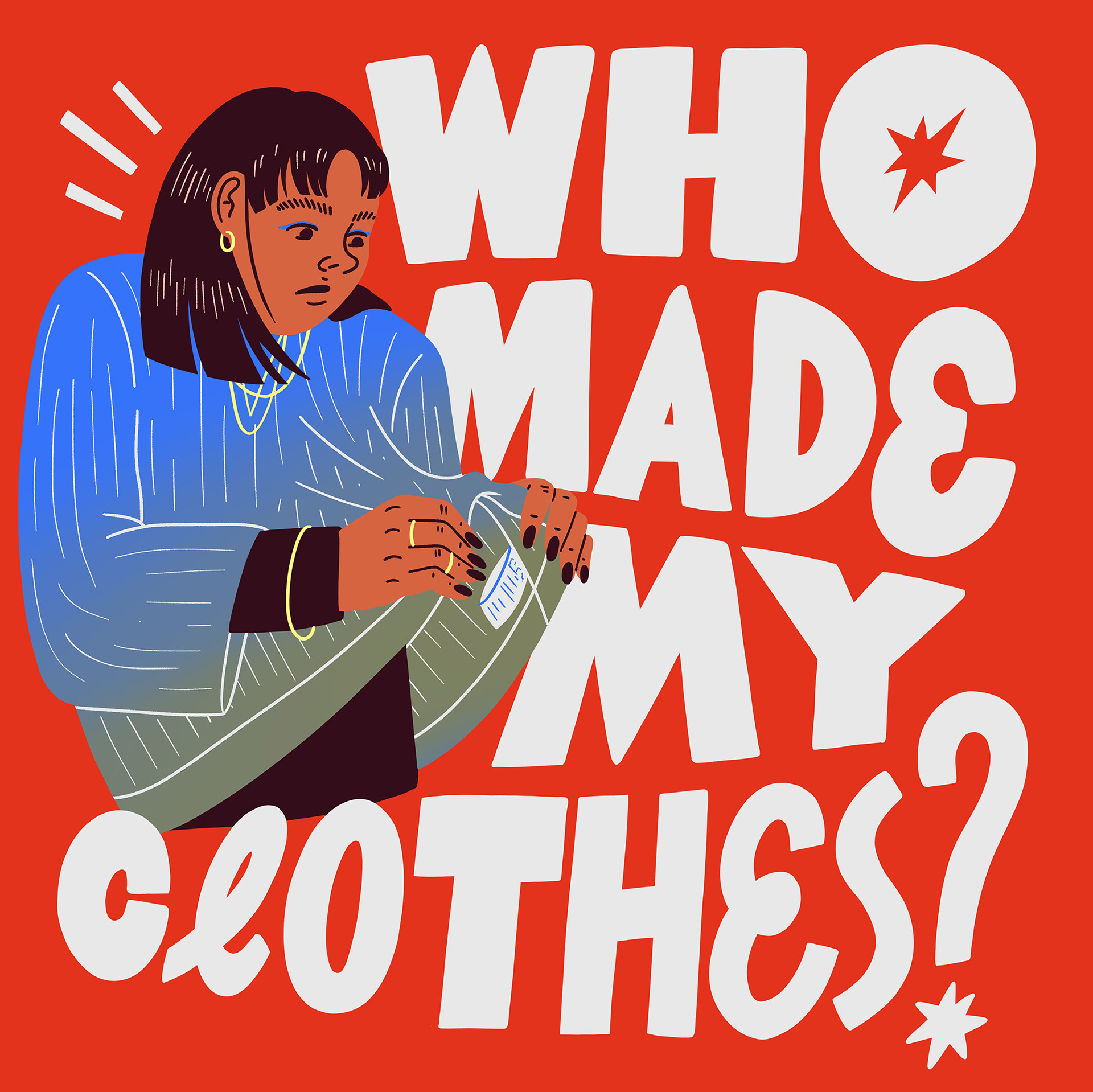

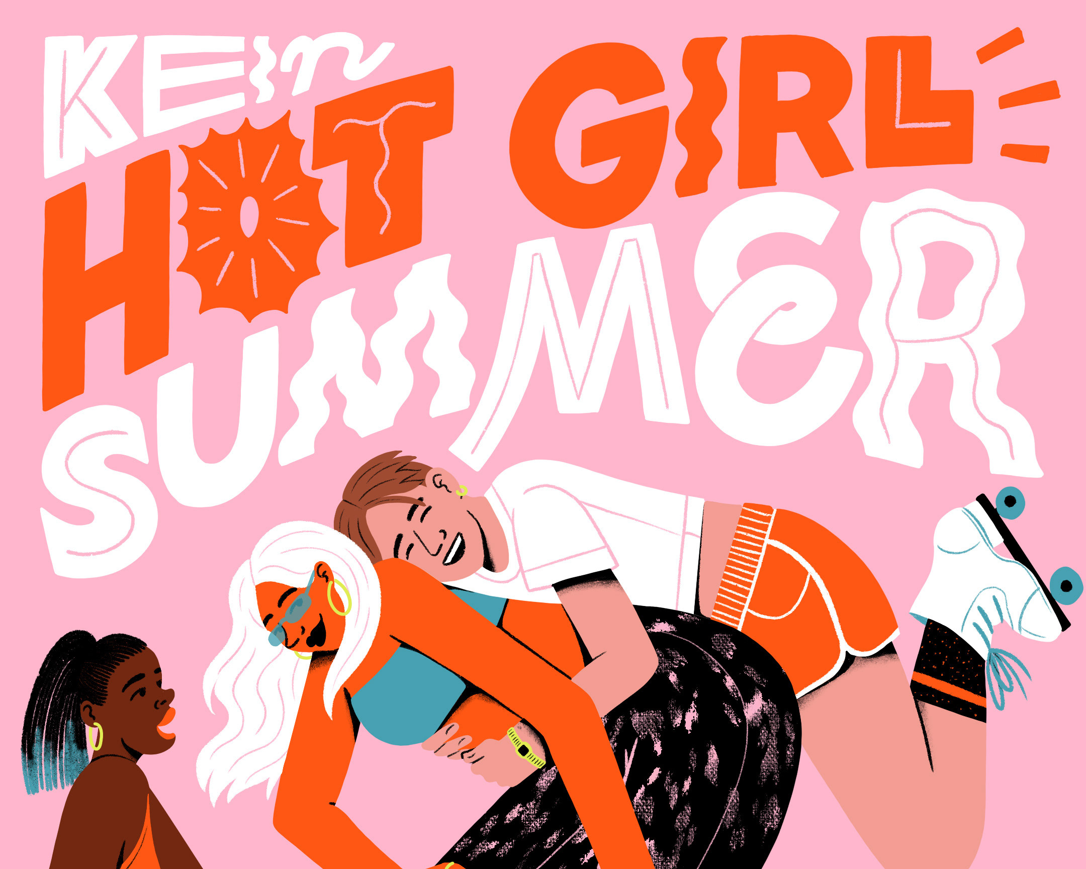
Campaign posters
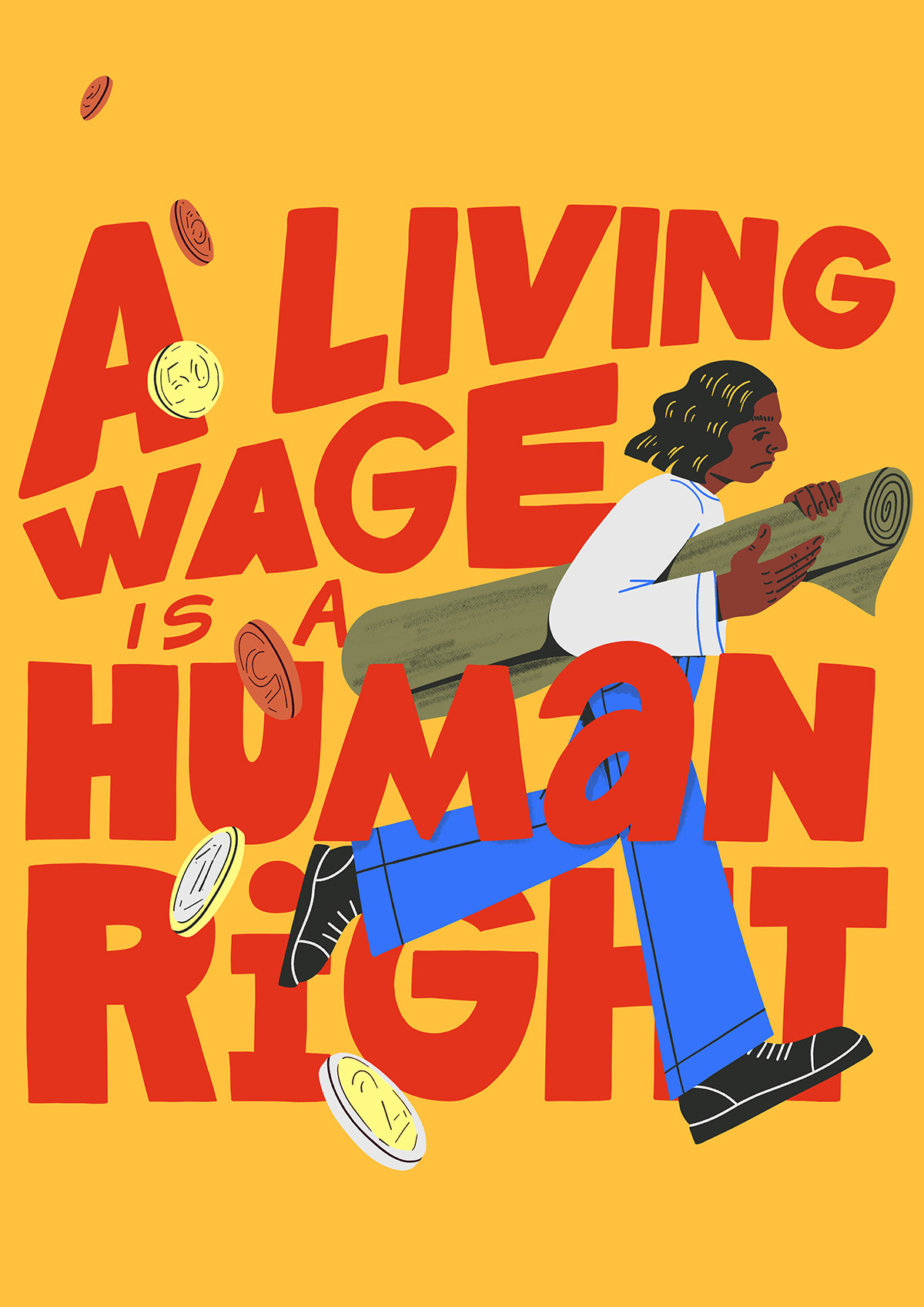
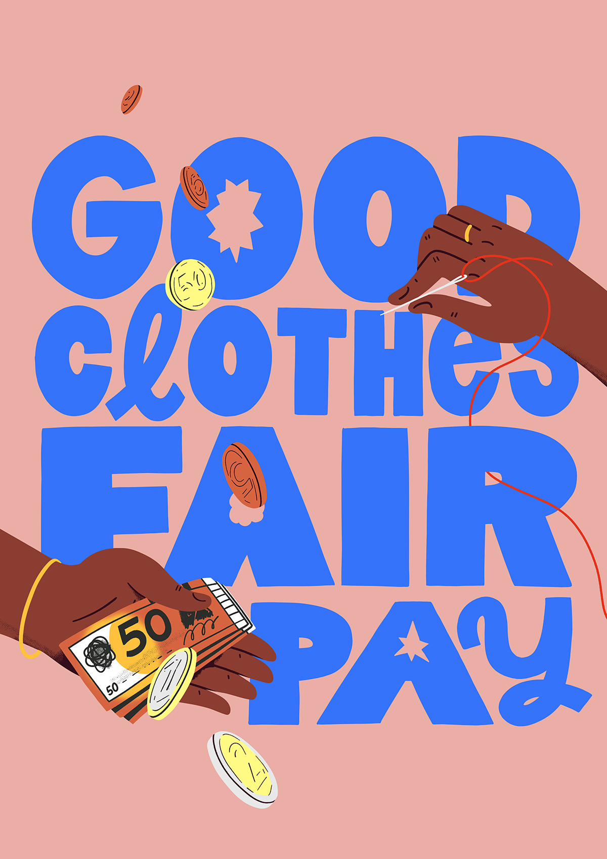
Campaign poster
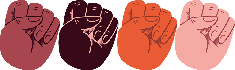
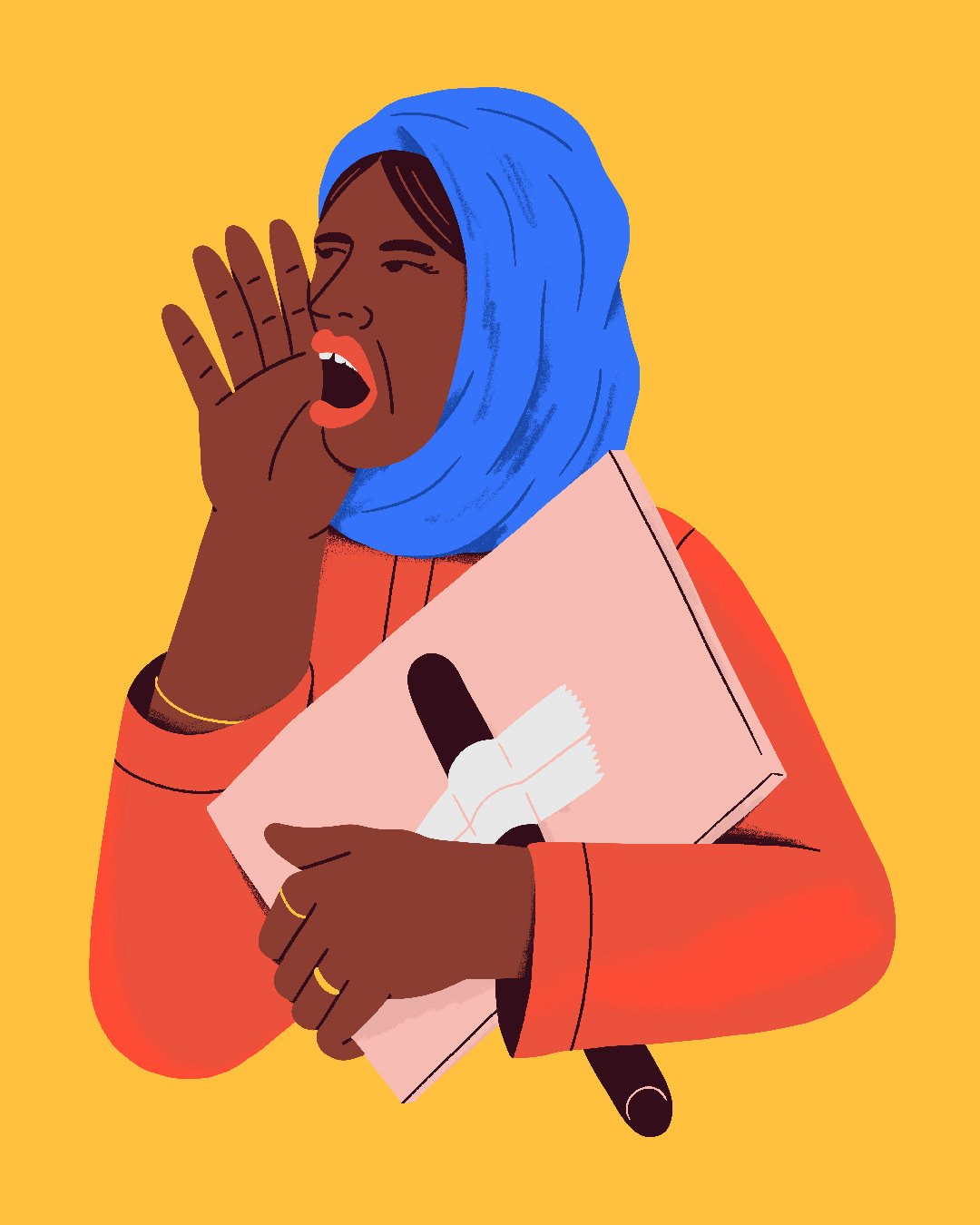

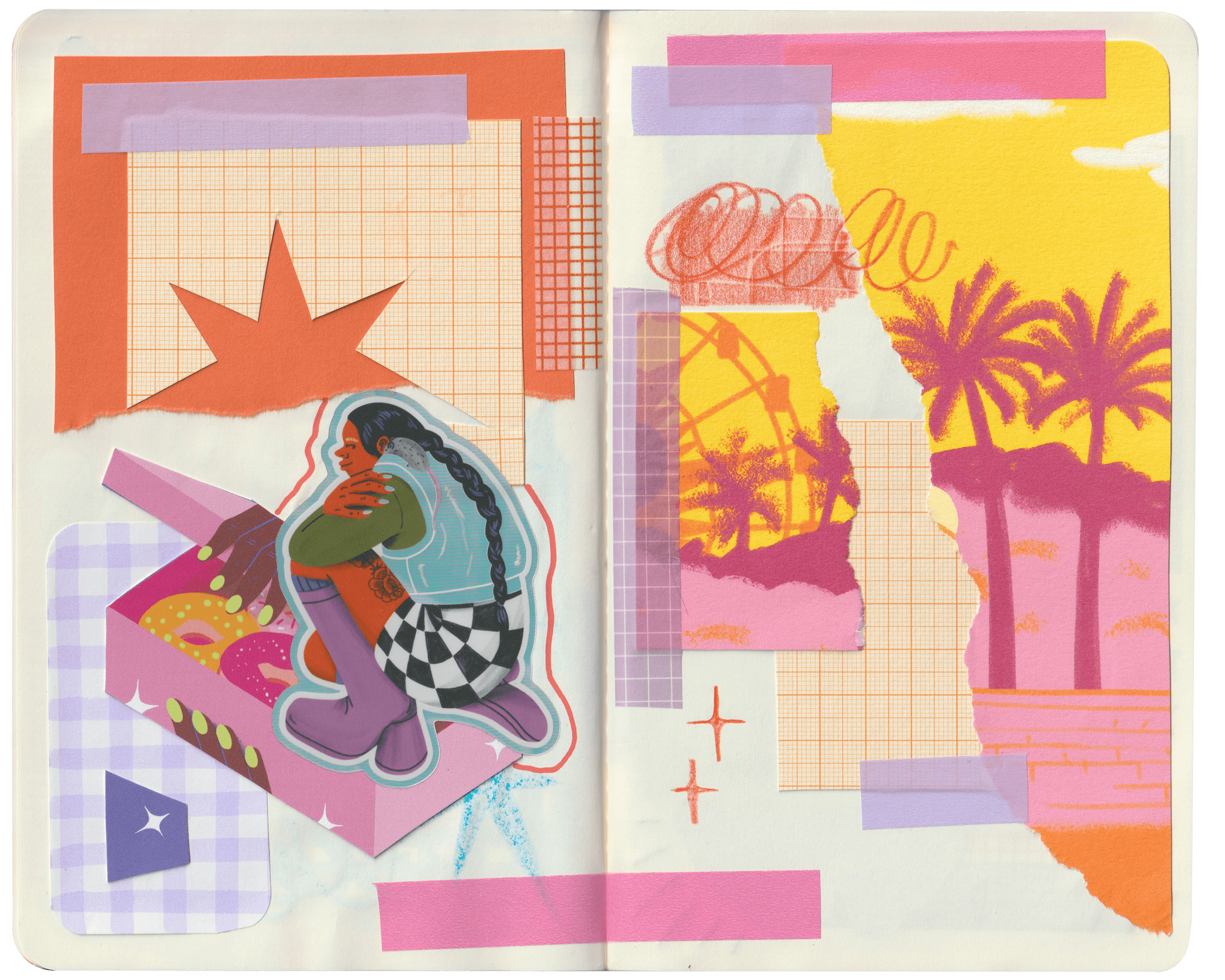
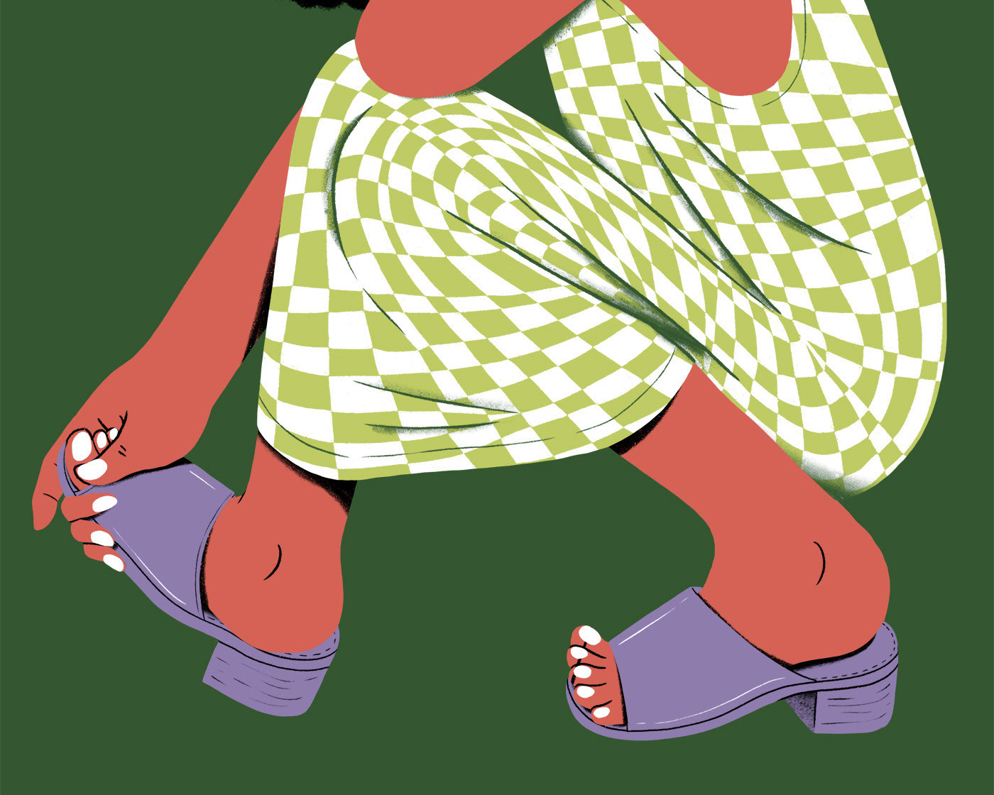
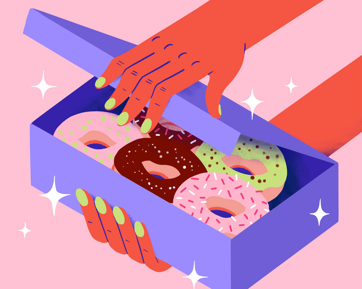
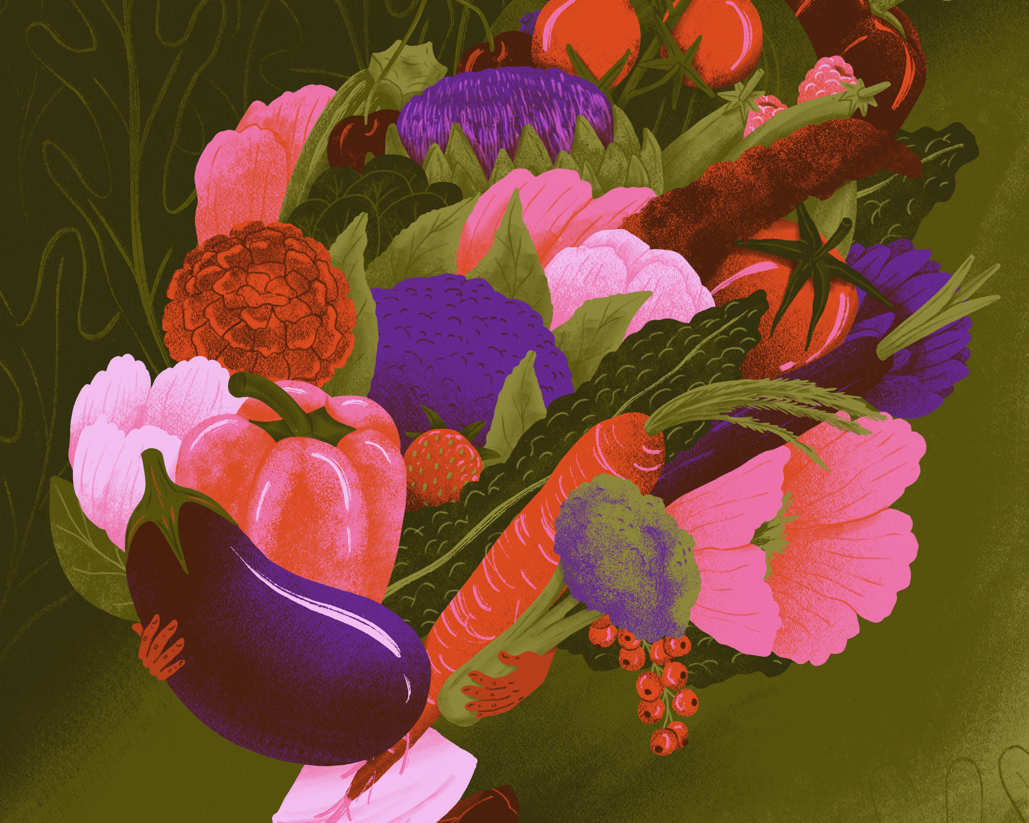
Small filler illustrations
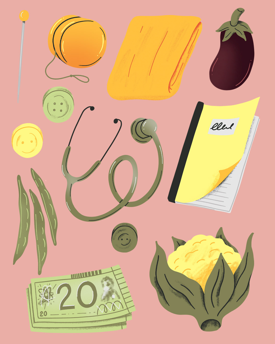
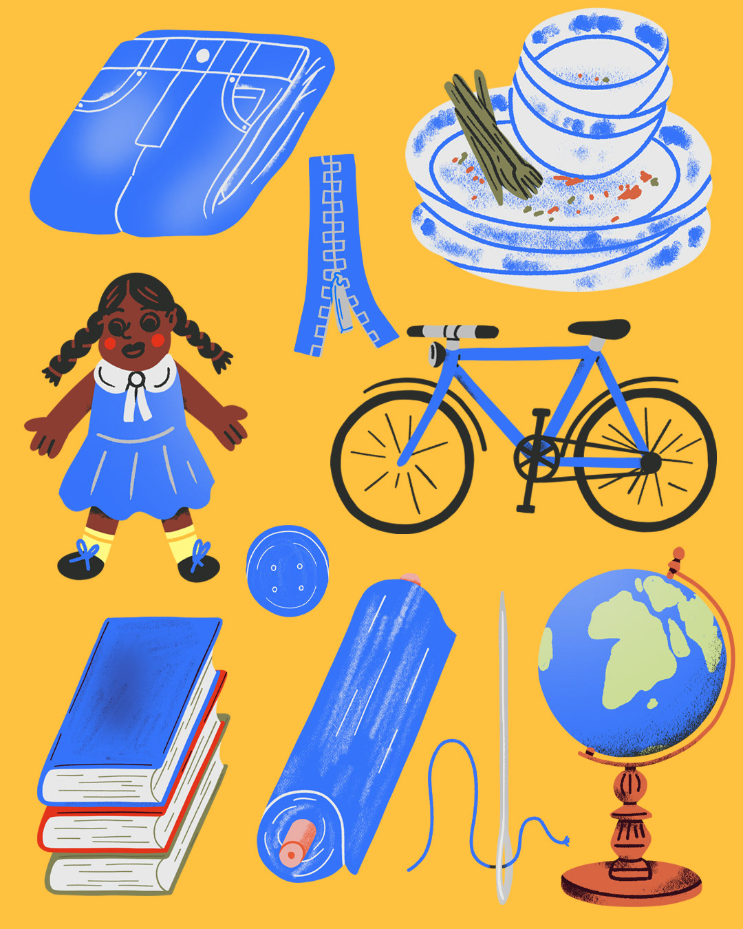
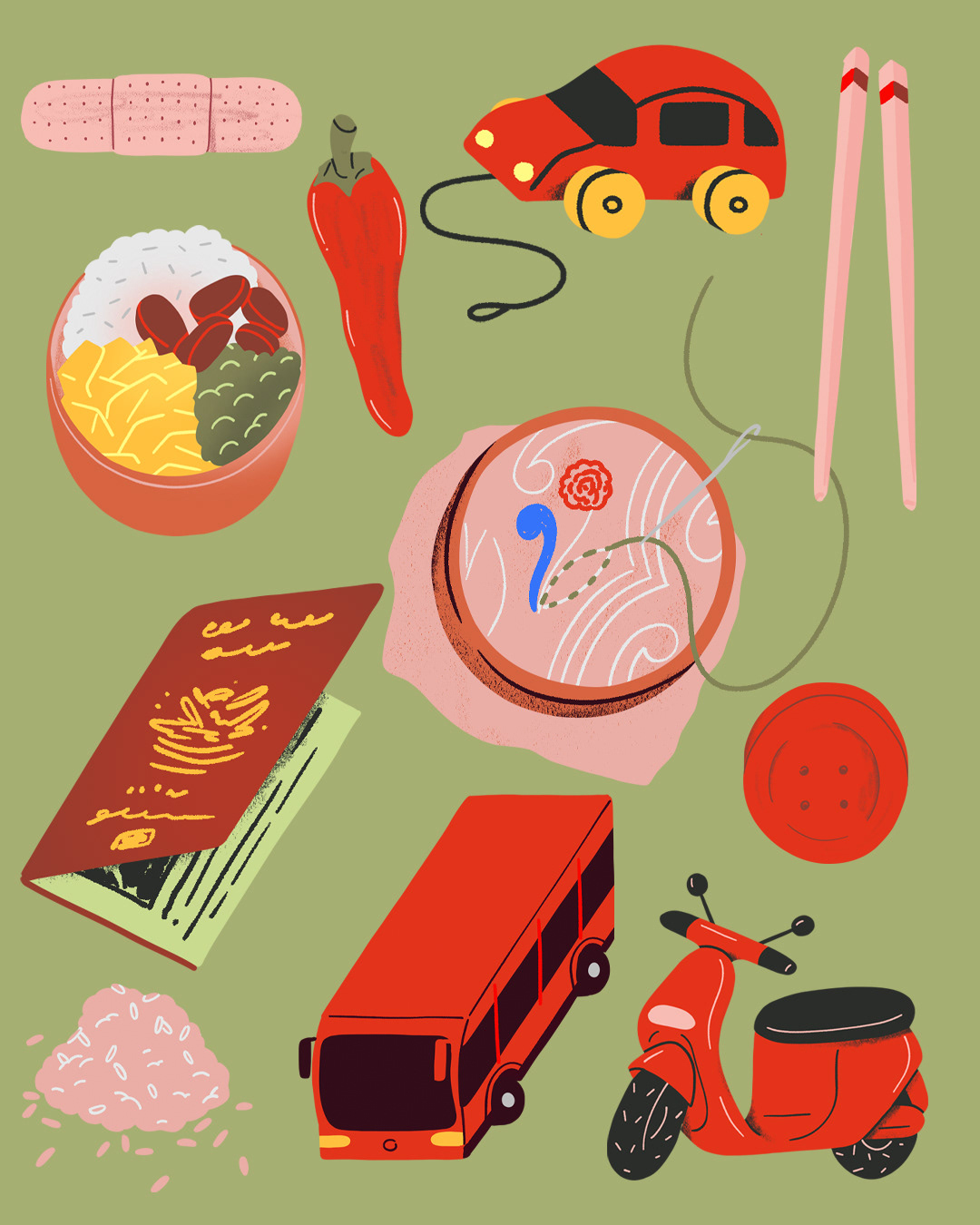

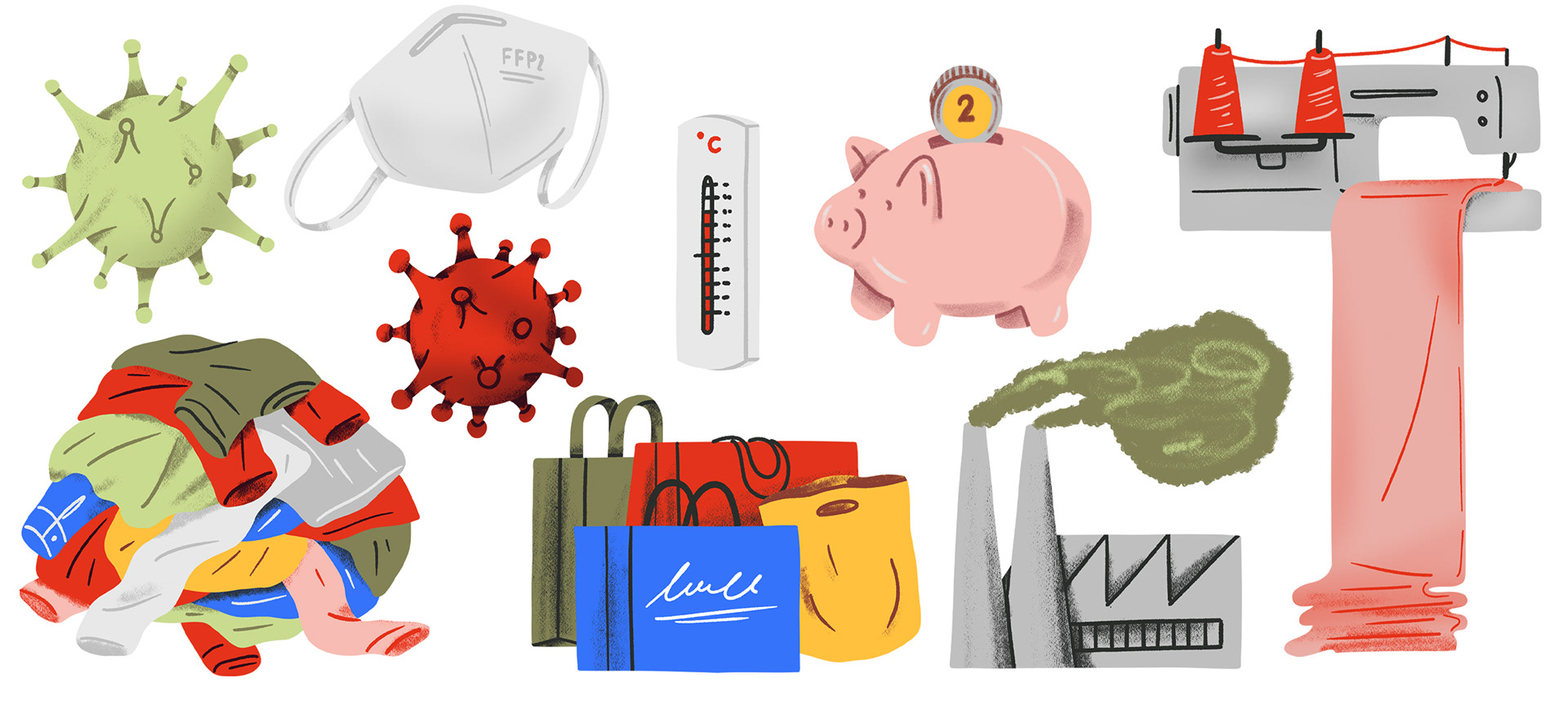
Small filler illustrations
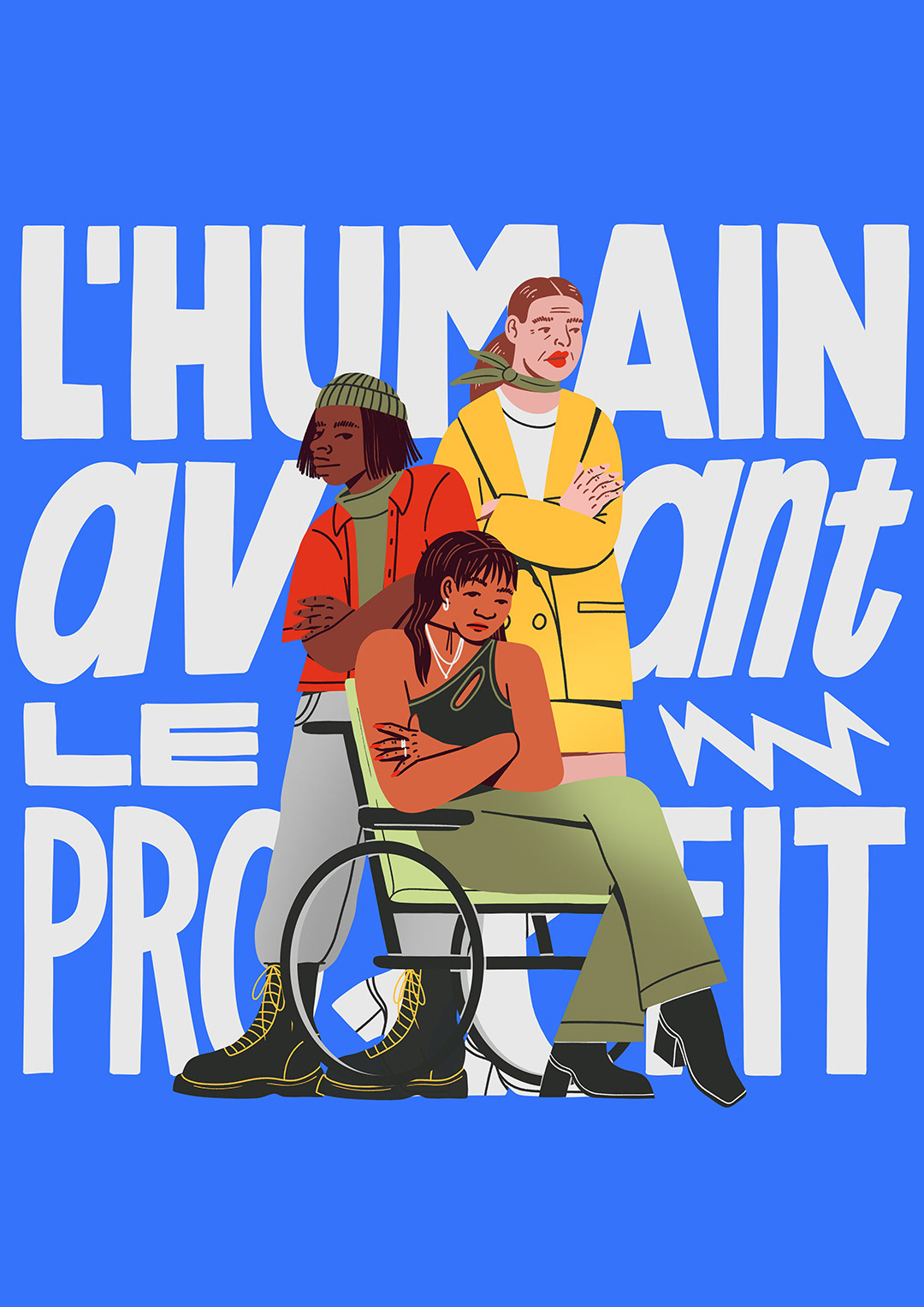
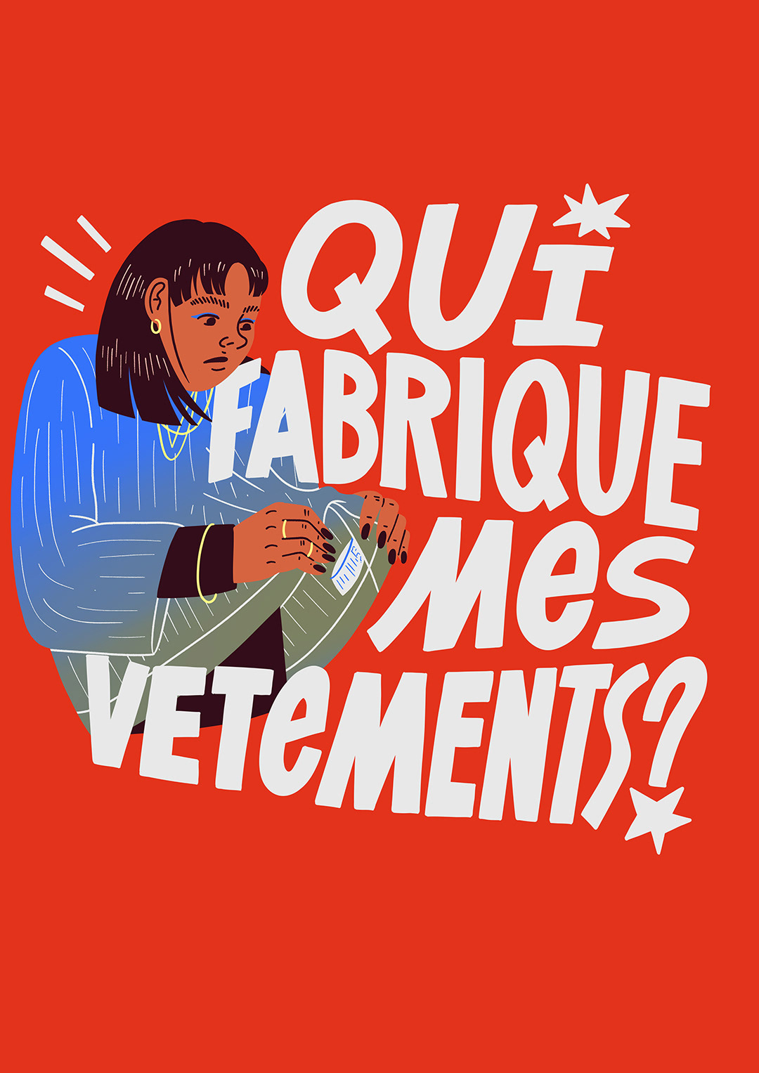
Translated posters into German, French, Spanish and Italian.